GRAY’S LANDING
R E B R A N D
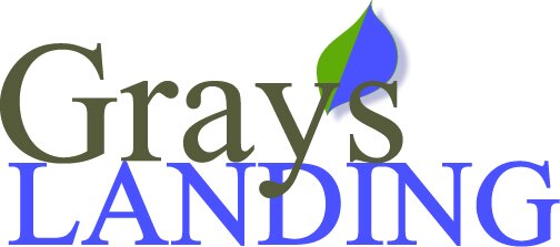
I used the same general color palette as the previous logo (shown last on the slideshow) because the reasoning was that Gray’s Landing has water and lots of nature around it, so it made sense to keep the green and blue. I switched the lettering to a more legible, humanist typeface. I also created two construction banners for this project to help lease the space and ordered them for the site. You can see my logo in use at GraysLandingDSM.com.