A S C E N T
“At the time of construction, the city of Westminster was gearing up to market itself as a new hotspot between Boulder and Denver. I came into the project after the main logo had been approved, so we worked from there and updated the color scheme to reflect nature with an upscale vibe.
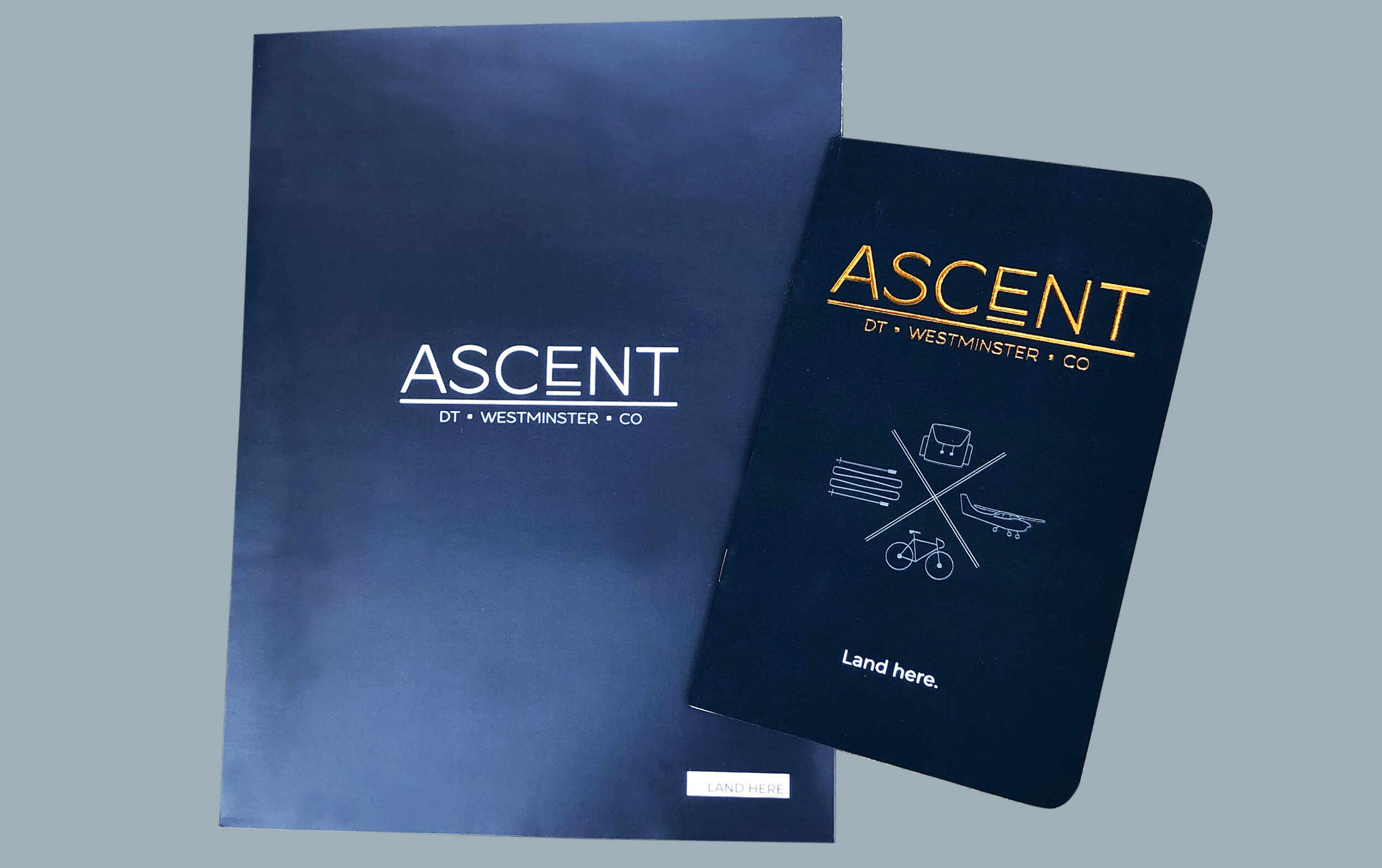
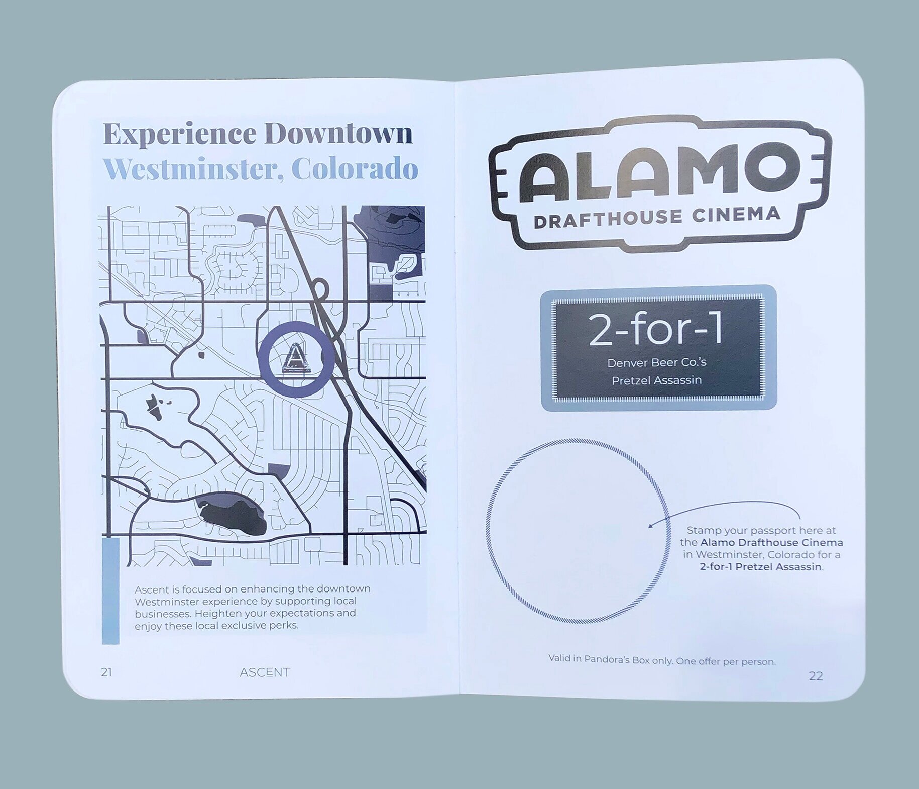
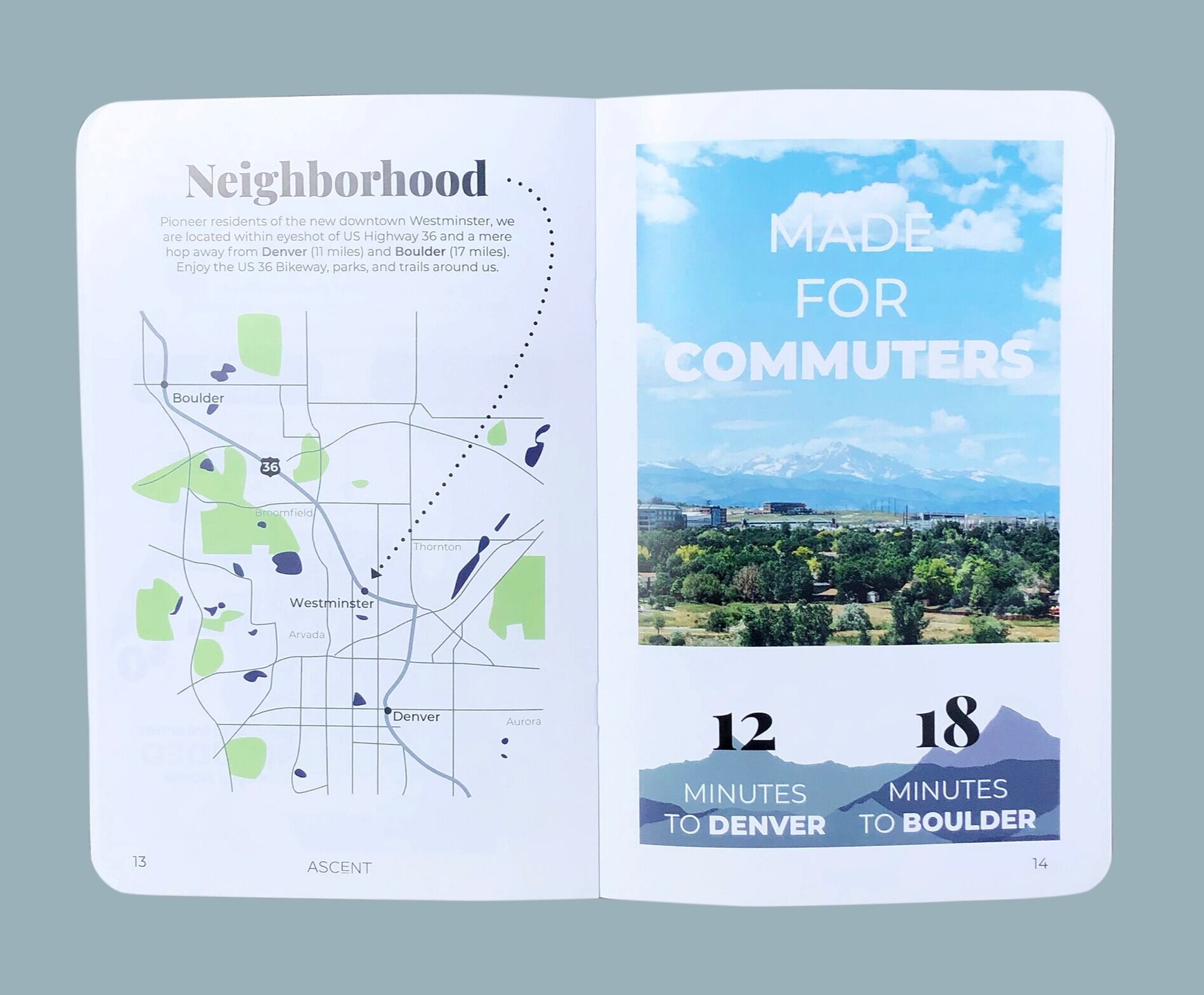
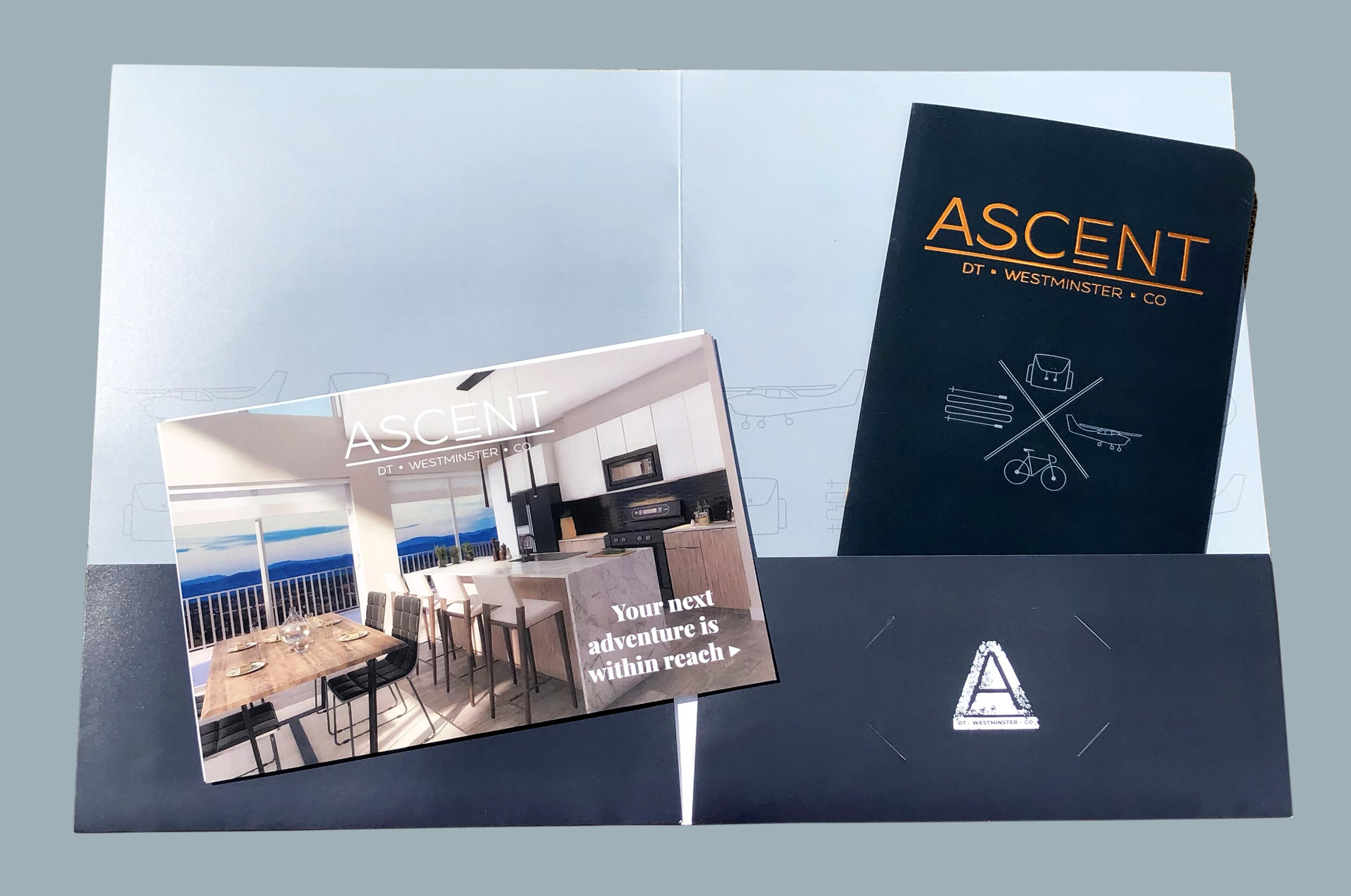
The brand story for Ascent had been tentatively decided upon as ‘moving upward’, but it wasn’t sparking any designs that made sense. I brainstormed what some of the collateral would look like and came up with a brochure that looked like a passport. The target demographic includes travelers, so we reformatted the entire brand around my passport idea. Everything would be luxury travel with a theme of being local. I was lead for the color story, print finishes, project management, supplementing content in collateral, and more.
You can find this branding available at AscentWM.com.”

secondary logo made to look like a passport stamp
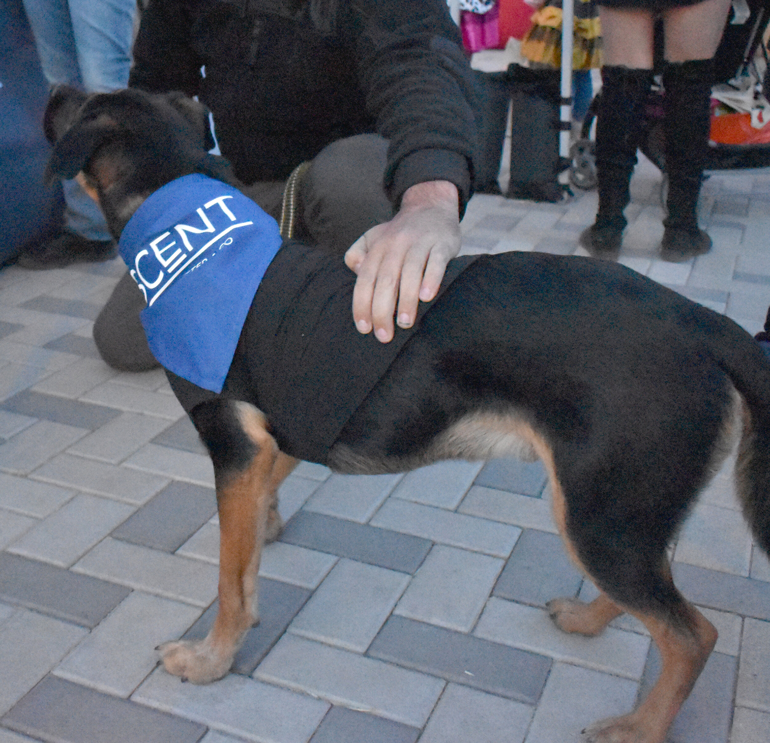
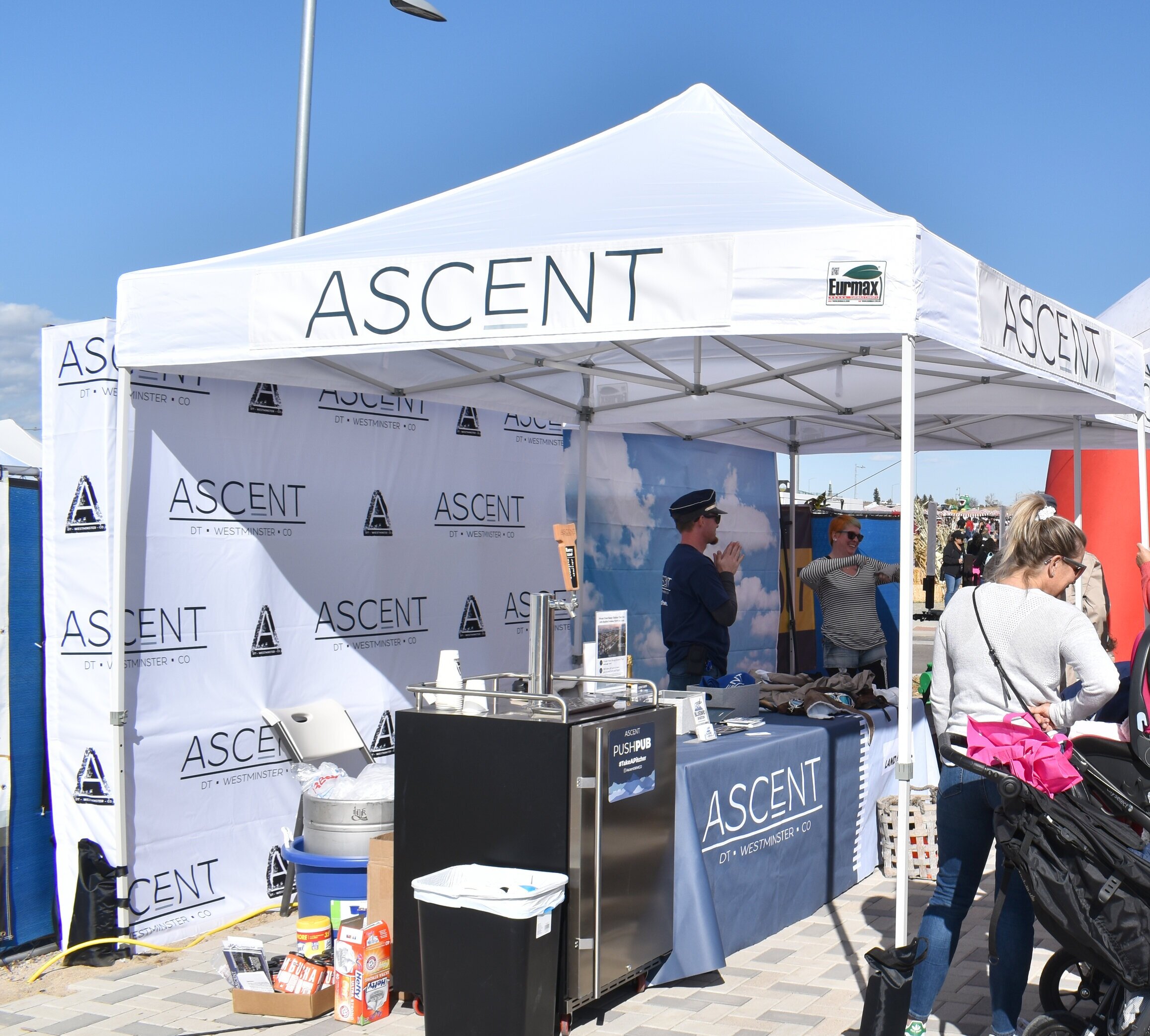
Above Designed and ordered pet bandanas, step and repeats, push pub magnet, cups, and tap handle, shirts, handouts, flyers, and tablecloth shown.
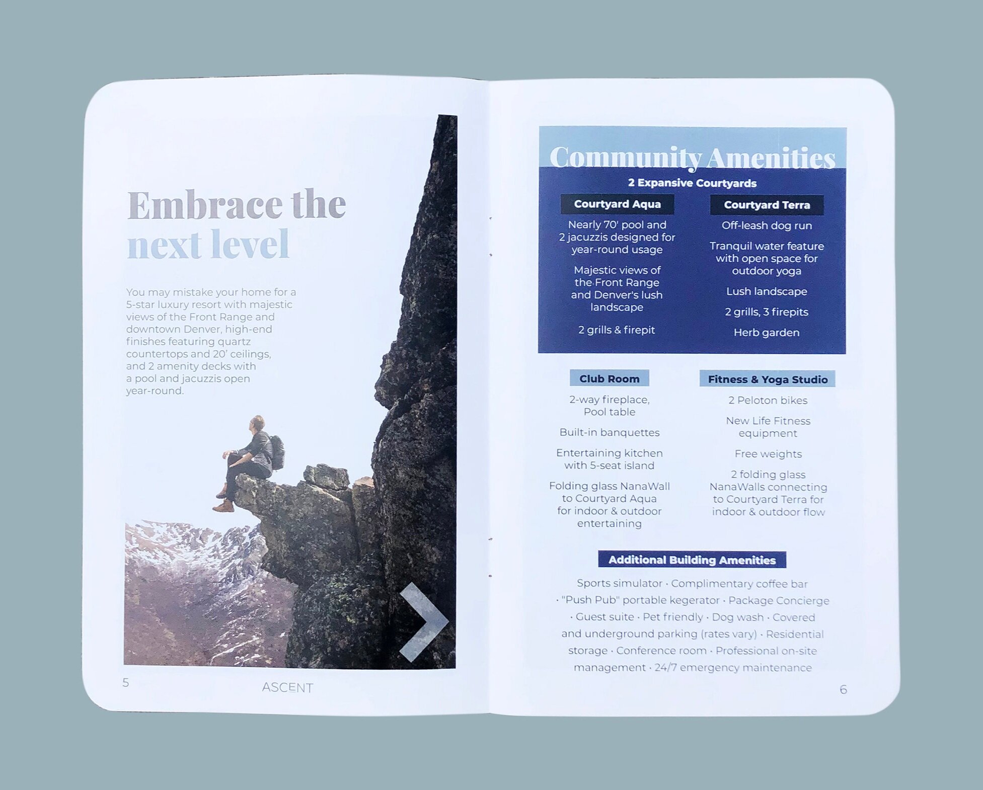
Below Created folder, brochure, mailers, business cards. Mockup of brochure shown along with final. I drew all maps and crafted all content in brochure, along with illustrating icons, researching vendors, choosing print finishes, and proofing.